


Mercury Financial
Rebrand 2023-2024
When I joined Mercury Financial in the spring of 2023, my primary role function was to drive the visual development of the company’s rebrand in lieu of an art director.
I worked directly with the Director of Brand Strategy and Chief Marketing Officers (leadership changed hands halfway through), coordinated my efforts with our in-house UX team and copywriter, and created all of the baseline rebrand content prior to codifying the updated design rules into a brand book with our internal design team.
What we started with:


Old UI design color palette and visual aesthetic

Old illustration style and card showcase

Old company logo variants; full logo and
mobile version
Ideation: First Passes
As mentioned above; this rebrand effort was split into two distinct phases; phase 1 under the old CMO, and phase 2 under her replacement.
The first CMO wanted to explore alternative approaches to the illustration style combined with a new brand tone of voice. Three concepts were chosen to explore; the first two in which my illustration style informed the tone of voice (Mosaic/M2) and one where the tone of voice and visual style were inspired by mental wellness apps.
We spent around 4 months developing written and visual content for these concepts and eventually conducted qualitative/quantitative review study comparing them to Mercury’s original style as well as two concepts proposed by an external agency.
Style 1: ‘Mosaic’


This style was informed by Mercury’s sharp geometric logo shapes and influenced by mosaic motifs. It was inspired by our company’s mission to help our users work their way out of debt and piece their lives back together.
The accompanying tone of voice was positive and uplifting while acknowledging our user’s financial history, and represented ‘putting the pieces in place to build a brighter future’
Mock-up content and illustration explorations:


Initial concept sketches


Style 2: ‘M2’
A spin-off of Mosaic one with a similar copywriting voice but more ‘serious’ illustrations and a refreshed sunny color palette.


Style 3: ‘Breathing Room’
This style was inspired by leadership’s desire to see what a fintech service would look like if it adopted the copywriting persona of a mental health app.


Phase 1
Qual/Quan Results

We brought Mosaic 1, M2, and Breathing Room mock advertisement content to testing alongside ‘control’ content of the original style and two styles created by the external agency.
While the feedback was varied, all new styles performed better than the control, and we were able to determine that Mercury’s user base was:
Partial to realistic depictions of people (photographs or less ‘cartoonish’ illustrative depictions).
Drawn to lively, vibrant color palettes.
In need of seeing realistic depictions of our credit card products (as some of them became too abstract)
Expecting to see visual languages that felt more traditionally ‘bank-y’ as opposed to styles inspired by other industries.
Phase 2: Redirection

While the first CMO wanted to lead the initiative copy and illustrations-first, the second pushed for an all-encompassing approach, and strived to bridge my work with pre-existing UX assets and illustrations from an external design agency Mercury had partnered with prior to my arrival.
Due to this change in approach, I was tasked with:
Modifying Mercury’s main and social media logos
Evolving and modifying the external agency’s proposed illustration style, color palette, and icon style
Creating a ‘shape language system’ which would influence the look and feel of all company designs, whether digital, print, or plastic.
Updating our social media templates and design rules
Designing and overseeing print vendor communications for Mercury’s new visa signature card product
Logo Facelift
The logo is arguably the most important and memorable piece to any brand, and ours was in desperate need of realignment to modern design trends.
Approach:


Leadership wanted subtle modifications - colors, shapes, and the basic logo elements needed to be revitalized while staying close to the original form, so that we wouldn’t need to file for a new copyright license.
During my evaluation of Mercury’s logo, I identified 4 areas that would refresh it without fundamentally changing it (based on competitive market research)
Colors: The old logo colors were de-saturated and low-contrast. I introduced a new dark purple to replace the grey, heightening the contrast and unifying it with the purple tones in our color palette.
I additionally made the blue and green colors more vibrant.Shape language: The old logo shapes had sharp, harsh corners.
I added corner radiuses as a compromise, staying true to their original shape while adding much needed visual softness.Font: I changed the font to Satoshi, aligning it to the font of our app and web experience.
Consistency between logo styles: In the old versions of the logo, the shapes and text placement were different from one another. By featuring the ‘m’ mark in both versions and keeping the company name separate, I ensured that the logo would feel united between long and shortened versions.
Initial passes/planning:
These are some of the 40+ alternate approaches I created in pursuit of the ultimate update. The logos featuring a circle harken to Mercury Oculus (an intuitive payment adjustment feature in the app) and highlight the fact that the wedge and arrow shape are meant to create an ellipse.


Because of our legal incentive to keep the changes as minimal as possible, some pretty cool options got scrapped. But they were still fun to create :)
Shape System
In effort to unite all new design efforts within the same visual language, our new CMO encouraged the development of a ‘brand shape system’ inspired by industry design superstars like Slack and Duolingo.

Base shapes:
Lower wedge, upper arrow, implied circle
To stay true to our design roots, I approached our new shape language system by deriving the base building blocks from the shapes of our logo.
I then mashed the shapes together and tried to come up with design ‘molecules’ which would serve as a visual anchor throughout our brand.
Initial Passes:
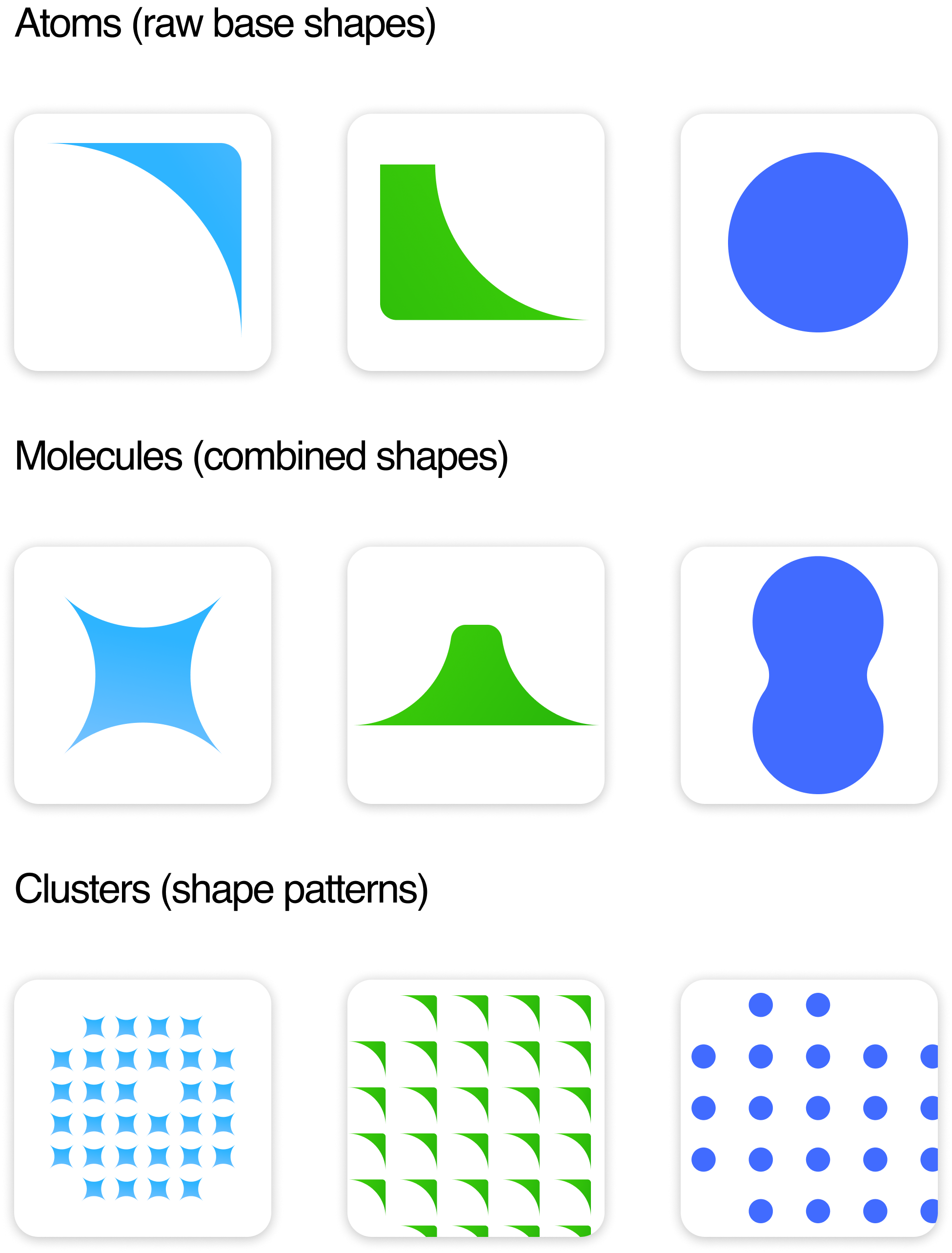
The most challenging part of this exercise was striking a balance between design utility and character/memorability.
Each of the shapes needed to have their own rules, so it was clear to designers how to keep their presence consistent.
As I experimented with different shape formations and patterns, I tried to think of use cases for each and determine whether or not they’d function as I planned. For example, could the circle molecule actually function as an image container, or would the shape distract from the contents?
I was designing our new approach to social media at the same time, which proved to be a great testing ground.

Final shapes & rules:

Pill (derived from circle)
Symbolism: Encompassing, calming
Use cases: containers, CTA buttons

Starburst:
Symbolism: Energetic
Use cases: ‘confetti’, background shapes

Circle
Symbolism: Balancing
Use cases: ‘confetti’, containers, background elements

Tabletop
Symbolism: Grounding
Use cases: background elements (anchored to bottom of composition)
Shape Confetti rules
Confetti is what we call clusters of brand shapes that may surround design elements such as photos, text boxes, or other focal points. It was imparitive to create rules for their use to uphold brand consistency.
Special shout-out to teammates Sophia and Sasha for helping test and define these rules <3


Illustration Style
As previously mentioned, the external design agency had provided our company with an illustration style and built out a small library of approximately 20 illustrations to replace their old-style equivalents.
However, there were at least 100 more illustrations that needed to be replicated in the new style, as well as some images that couldn’t translate as the agency hadn’t included any human depictions in their work.
During the final phase of the rebrand, I worked together with an external contractor to update all of Mercury’s old illustrations into the new style.
I independently developed brand guidelines for how to illustrate people within the style, and added it to our new brand book for reference.


Excerpts from Mercury’s Brand Book’s Illustration section.
Social Posts
Mercury’s social channels help to humanize the Mercury brand, setting them apart from other fintechs with eye-catching designs and supportive copy.
Approach:
These designs developed organically alongside all of the other rebrand advancements, which meant that I made many different executions and approaches before leadership settled for the final style.


Social posts pre-rebrand
Evolution/Iteration


Final Look & Feel

Results

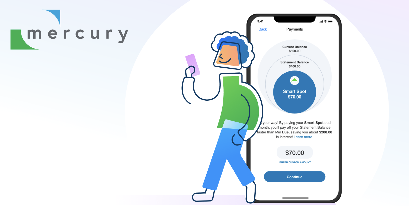
In June 2024, after a year of hard work and coordinated efforts between UX, design, copywriters, marketing leadership, and the ghosts in the walls of the Austin office, Mercury’s app and web experiences updated to feature the new refreshed look and feel, ushered in by the release of its shiny new purple card product.
As of December 2024, the app reached 4.9 in IOS and 4.8 in Android ratings respectively with 2.61MM lifetime downloads combined, and earned a rating equal to or higher than the top 10 Credit Card mobile apps in market.
In the app reviews, satisfied customers frequently cite the ease of use and visual appeal of the experience, and remark at improvements post-rebrand.
Despite the redirection and difficulties along the way, our team was able to pull this project off in record time, and I’m so grateful to have been able to contribute.
Thank you’s & Acknowledgement’s
None of this work would have been possible without the aid, support, and assistance of my lovely coworkers and team members; special thank you to the following contributors;
Sophia LaPietra: Served as team leader and art director during the last leg of the rebrand by overseeing Brand Book developments, managing external assistance, and bridging the gap between my visual design work and UX.
Tanya Walker: Helped oversee my initial visual development process and kept the team on track.
Christy Williams: Supplied this design work with lovely copywriting and singlehandedly created Mercury’s revamped tone of voice guidelines to pair beautifully with the new look and feel.
Mercury’s internal UX team: Thank you for tolerating my requests to change colors, assets, and more for the sake of the rebrand, and bringing the new look to life on our app and web experiences.
And to everyone else who contributed, thank you thank you thank you!
